Type
When used thoughtfully, typography becomes a powerful brand tool that can add visual meaning to what is communicated. Cal Lutheran’s typography communicates clearly and cleanly, and is flexible in a wide range of situations.
Note: In digital work, fonts should never appear at a size smaller than 14 pixels.
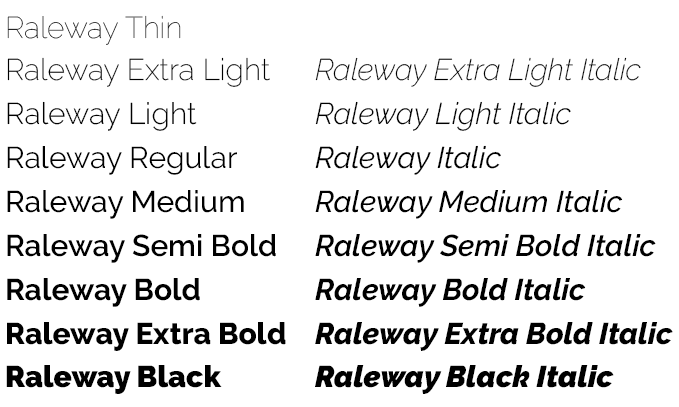
Raleway

Raleway is our sans-serif font. It has seven weights, all with matching italics and
small caps, and is appropriate for all uses. It works especially well set in all caps
at lighter weights, such as thin or extra light.
Note: When using Raleway for headlines, set the tracking between 25 and 50. When using
Raleway with numerals, activate the OpenType Proportional Lining feature to ensure
that numbers do not decend below the baseline. This feature is found under the Character
panel options in Adobe InDesign.
Available as Web font.
PC alternative: Verdana.
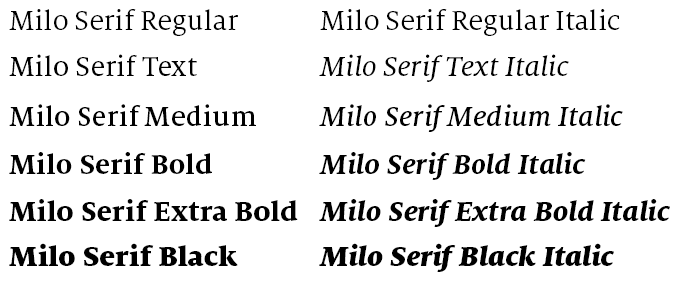
Milo Serif

Milo Serif is our serif font. It has six weights, all with matching italics and small
caps, and is appropriate for all uses. It works especially well in body copy for most
pieces, or for headlines on formal communications.
Note: When using Milo Serif for body copy or captions, set the tracking between –5
and –10.
PC alternative: Times New Roman.
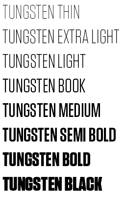
Tungsten

Tungsten is our accent font. It has three weights, and should only be used to support
Raleway and Milo Serif.
It works especially well for callouts and captions, as well as for subheads when the
headline is set in Raleway.
In practice, Tungsten is very effective when used on banners or oversize graphics.
Note: When using Tungsten, set the tracking to 25 or higher.
Available as Web font.
PC alternative: Impact.
Frutiger
Frutiger is our signage font. It should be used only for all permanent signage appearing
on campus. It should NOT be used for any purposes other than campus signage.
Note: When using Frutiger, the default tracking should be set to –20.